 Now I'm about as big an Apple fan as you can get. Sad, but so very true. I have an iMac, various iPod's including an iPod touch; an Apple TV an iPad and an un-nerving appreciation of black, turtle-neck sweaters. I love all that Apple is - how the products function, how the applications interact, how it all works so beautifully in the way I want and even the gorgeous, eye-wateringly beautiful designs.
However, I downloaded iTunes 10 the other day.
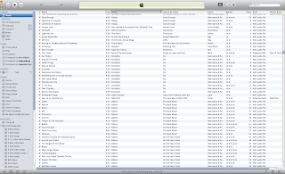
I was staggered. I've never seen anything from Apple that is so utterly devoid of beauty and sex appeal. This is aside from the many aspects of iTunes 10's functionality which seem to have been removed. It's grey (or gray if you insist). Very grey. Very, very grey. In fact, it is greyer than an elephant lying in concrete. All the buttons are grey. The lists are grey. All the headings and titles are grey. When you click on anything - it stays grey.
It's grey.
It is devoid of any colour. And I hate it. But it's OK because many, many other people hate it too. Now I'm all for sleek, modern design. Apple's renowned for its minimalistic, artistry when it comes to the creation of their products and applications. But this, this is like a pencil drawing. It has about as much visual appeal as Celine Dion, naked, astride a Velociraptor ... in gravy. Wait - that has too much colour in it.
Suffice to say - using iTunes 10 is a depressing, joy-sapping experience. A bit like biting your own toenails after running a marathon. So why have Apple done this to us? What are they trying to prove? Should I stand accused of 'monochromophobia'? Well if I am, then I plead guilty as charged.
I hate it. So there you have it - in black and white. Not grey.
No comments:
Post a Comment